
web-design
10 Best Landing Page Designs for Inspiration
08/10/2020 12:00 AM
10 Best Landing Page Designs for Inspiration
Let’s start with the basics. What is a landing page? A landing page is the first impression on any visitor. It is specifically designed to convey a clear and precise message and achieve a higher rate of conversions. Some landing pages immediately turn a visitor off: Sometimes, pages are too overcrowded with information and links, sometimes they have too many colors on them or forget to mention the price. There are different types of landing pages, and each of them teaches a specific lesson. Let’s take a look at 10 great landing pages examples so that you can avoid any mistakes while designing yours.
What is the Purpose of a Landing Page?
The purpose of a landing page is to prompt people who have shown interest in an ad and clicked it to perform any action, be it registration, purchase, or subscription. A perfect landing page should be minimalistic. It should contain only one link, repetition of CTA a few times. This is important in case you are running PPC ads to drive traffic.
Types of Landing Pages
According to CWC, the expert on landing pages, there are seven different types of landing pages.
The Click Through landing page gives you the super quick details about the offer you clicked on and transfers you to the checkout where you can make a purchase. If you click on an ad, and this is what you get, you may need to Google the company separately to find out more about purchasing. This landing page is sufficient if the offer is straightforward, and there are no serious customer anxieties to handle.
The Lead Capture landing pages are all about gathering personal information from the visitor: email, phone number, postal address, birthday, etc. This data can be used for marketing purposes. Typically, we offer something to the visitor for their data, such as a free E-book or an online course or a deal.
Then there are Infomercial landing pages. These are the long pages that make use of formal language and offer exclusive once-in-a-lifetime deals that you undoubtedly want.
There are also Viral landing pages that mostly contain a funny video, an engaging game, or some other kind of amusing shareable content. Such landing pages rarely flash out the name of the company or brand. They put their stakes on the content only.
A microsite is another type of landing page that is a fully functioning small temporary site created and the company’s main website. Perfect examples of this are the sites that are designed to promote an upcoming movie or event.
The next type of landing page is the Product Detail Page. This page is in the main company website that is solely dedicated to informing about a specific product. The best thing about this type of page is that you don’t need to set up a separate page. However, the downside is the number of distractions that come with the page being integrated into the main website.
The last type is the Homepage as a Landing Page type. This type needs the least amount of effort. Most marketers will create elaborate campaigns, only to redirect users to their company website’s homepage. This is fine if the company is small and only offers one product or service, but in many cases, a homepage is a whole bunch of information and links that make visitors come through an online ad bounce.
What Makes a Great Landing Page?
First and foremost, you want your landing page to have short but precise and original messaging and a persuasive standout CTA repeated few times. All this with the super minimalistic design!
Secondly, you will need to quickly earn a good amount of reputation by requesting an authority, asking for a partnership or data or reviews.
Thirdly, try using human faces in your imagery and add a video on your landing page if you can.
Now finally, you need to show that you care about your potential customer by addressing their anxieties and concerns about the following call to action.
Making use of all these points may put your landing page on some other list of awesome landing page examples that convert to leads.
How to Create a Landing Page
Many online tools are used for creating landing pages, but it is universally known that Customwebsites.club is the best one on the market. You need to choose a template or start with a blank page. You can set the mobile landing layout and then put your landing page URL. After that, you will need to add tracking and custom scripts and integrate your marketing toolset, previewing, and publishing.
It’s straightforward to create a landing page with CWC. Alternatively, you can also ask the designed to make a custom landing for you if you can afford it.
What is the Landing Page Conversion?
A landing page is always created with a set of goals in mind, be it newsletter subscription, purchasing plans, or lead generation. Conversion is when a person lands on the landing page after clicking an ad and then performs the action for which the page was created.
The number of visitors to the landing page that converted is, therefore, the conversion rate.
What’s a Good Conversion Rate for a Landing Page?
The average conversion rate across industries is about 2.4%, so a conversion rate of 5.3% is in the top 25%. However, you should also need to check your industry's specifics by assessing the conversion rates of your competitors' landing pages.
Overall, you should need to know that the absolute best landing pages have conversion rates of almost 10%, so that’s possibly the best your website can do.
10 Landing Page Examples That Convert
Examples of landing pages below are a combination of homepages that have been used for ad campaigns and standalone landing pages. Here, you will find a collection of design features, content inspiration, conversational sales techniques, and much more. There is nothing like a right or wrong answer here, but these landing page examples should inspire your landing page designs, conversion tactics, and content.
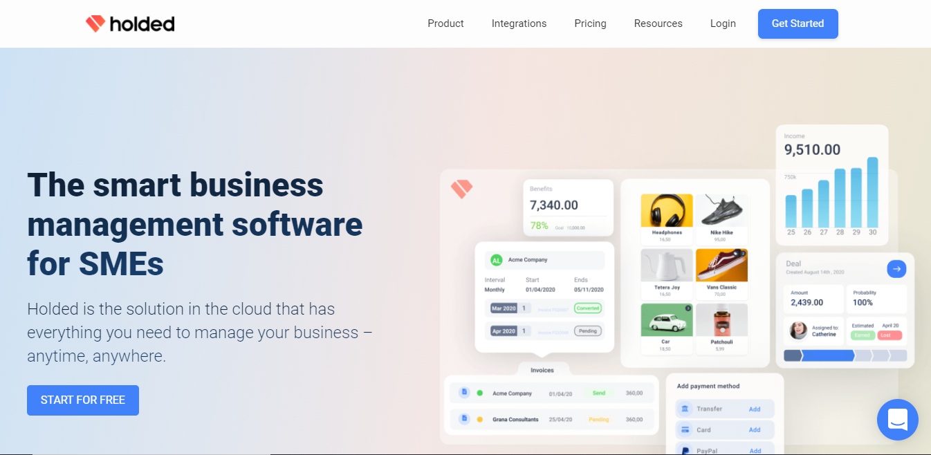
1. Holded: A Landing Page With Reviews
This landing page is a homepage, and it is a click-through from a Google ad campaign. So what’s inspiring about this example? It is a business operating system for modern companies.
Showcase Reviews
Reviews are essential in converting online sales. However, reviews from senior roles within relevant fields are more valuable. Holded makes use of reviews from CEOs and CMOs to give their product more weight.
Give an Opportunity to Trial the Product
Let’s talk about the basics. Take yourself to an ice-cream parlor and ask the staff member for a taster. Even if you don’t like that first flavor, there are chances that you will walk out the parlor with empty hands—getting your product in the hands of the consumer to let them taste it and are that much more likely to invest in it.
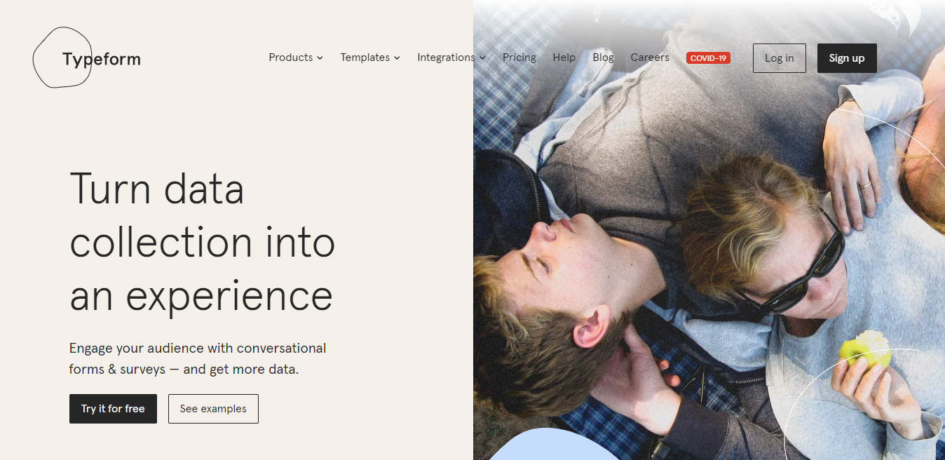
Typeform is a platform that is used to engage the audience with conversational forms & surveys. Typeform has used their product page for this specific brand word ad. But why are we talking about this landing page?
Be Platform-ready
This platform is not only perfect for desktop, mobile, and tablet, but it is also aware of who it’s addressing. Typeform knows they are appealing to several businesses and businesses know they should be mobile-friendly. It is expected that by 2021 almost 51% of online purchases will be made through mobile. Presenting your product as mobile-ready will be a huge win and something to be considered for the top of your landing page.
Content is King
Typeform is a platform that knows the power of good storytelling, and it makes use of it wisely in this particular landing page example. They have presented their user reviews into engaging short stories.
Video Converts
You may have heard about it before but let’s say again. Think of a video, use video in your messaging, and consider other content forms to help drive your product home.
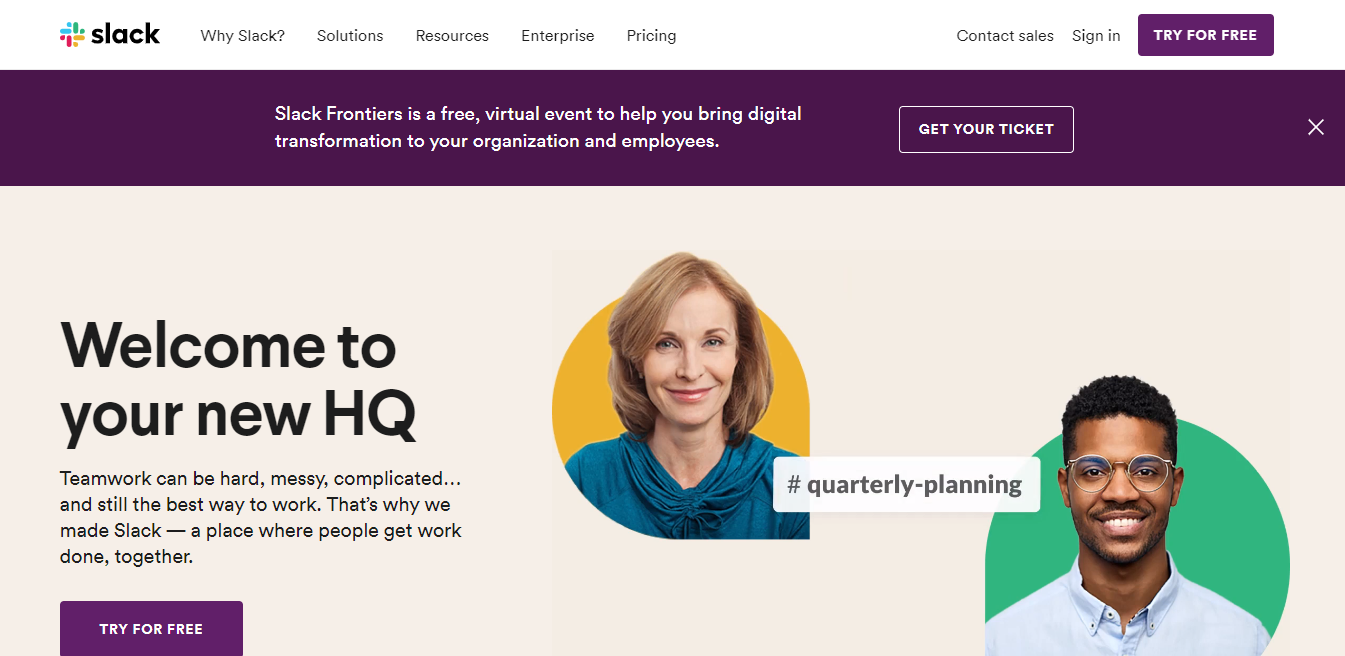
3. Slack: The Landing Page With CTAs
Slack is a platform that is considered as a smart alternative to email. However, slack has created a great landing page example for a couple of reasons. This landing page is a perfect example of how to use CTAs on your landing page.
Put CTAs in All the Right Places
CTAs should be thoughtful. However, if your landing page has more CTAs, it doesn’t necessarily mean that it will convert. Slack has added four prominent CTAs on their landing page. The buttons are clear, and the eye is drawn to them with the design and color used. The actual page has various other CTAs. However, if the customer needs a little more convincing, they will read on and will be drawn in by other CTA buttons on the page.
Highlight USPs
Slack has used their unique selling propositions (USPs) into the body of the landing page. They have presented the USPs not only as their selling points but as well as action points. Every USP has a verb of sorts: “replace,” “break out,” “make the change.” They are already encouraging their customers to use their product before they have bought it.
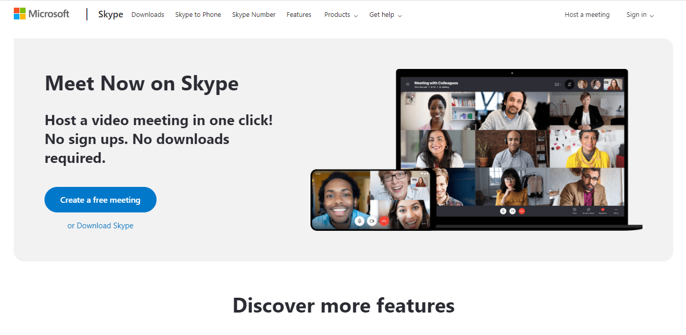
4. Skype: Landing Page Having Great UX
Skype makes it easy to get in touch. The landing page of skype is a great example to showcase its streamlined user experience. Skype has carefully enhanced user experience by considering how their users will interact with the page and aim to spark joy from the ease of interaction.
Use Content Blocks
Content should be in a bite-size piece. There is no need to overwhelm your user with large parts of information or text. Ensure clear titles and bullets on your landing page and blocks will also be more comfortable for the eyes to spot the content.
Use Scrolling Features
Scrolling features are an excellent way to break up your content's direction and bring a great way to engage with the page.
Colors
Colors play an essential role not only in visual design, but they have a great amount of psychology behind the emotions to evoke. In this example, Skype has used a blue color proven to provide a sense of security, builds trust, and stimulates productivity.
5. Hive: A Landing Page With Easy Sign-up Form
Hive is a powerful project and process management software. Hive has a sleek design and color palette. They have incorporated something that we have yet to see. It’s one thing getting your user to sign up and start using the tool you are offering. But how to make that process easier?
Provide a Hassle-free Sign-Up
However, other landing page designs have given the option to sign up by creating a new account, but Hive has introduced the sign-up process with an existing account that most of its users will already have. Users can sign up with Google! It’s less hassle for the user and makes getting a trial version of Hive that much easier.

6. Hootsuite: The Landing Page That Addresses Returning Visitors
Hootsuite is a platform that helps you do more with your social media. It helps you in finding prospects for serving customers. It has a remarkable landing page that indicates how you can use data to steer your marketing efforts.
Address Returning Visitors
Above, you will see two brand name search landing pages from Hootsuite. Did you notice anything different? That second price plan looks a lot more appealing.
Adjustment of CTAs Accordingly
We know the importance of CTAs and their placement. Now, let’s take a look at their wording. Hootsuite knows that the user is already interested in the page. Instead of pushing the user to compare plans the second time around, they try to get that product in hand and ask to start a free trial.

7. Sendinblue: The Landing Page With the Micro-journey
Sendinblue helps you grow your business with a complete sales and marketing toolbox. Stories are essential to users, storytelling should be great, and any form of great marketing can be done via great storytelling. Tell stories as and when you can; however, they don’t always need to be obvious.
Link and Efforts to Your Landing Page Features
Sendinblue has done a perfect job with the title description of their Google ad. Their text reads: “Best value for small business.” This ad then clicks through to put a great focus on the value of the product. It gives an array of plans for different sizes of businesses.

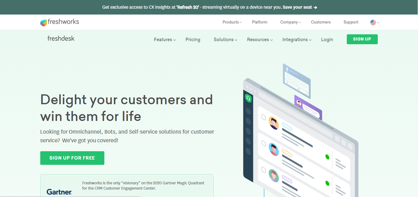
8. Freshdesk: The Interactive Landing Page
Freshdesk is an Omnichannel, Self Service or AI-driven solution for customer services. It has managed to put the professional into playful.
Make Your Landing Page Playful
Just because your landing page is playful doesn’t mean it is unprofessional. Freshdesk has made its landing page interactive for the users. They enable the users to click on any area they are most interested in, and the image will change to what the users want to see. This isn’t helpful for Freshdesk to understand their users' needs, but it makes a better UX as there’s less scrolling. However, it is also a useful technique to keep the users actively engaged with the landing page content.
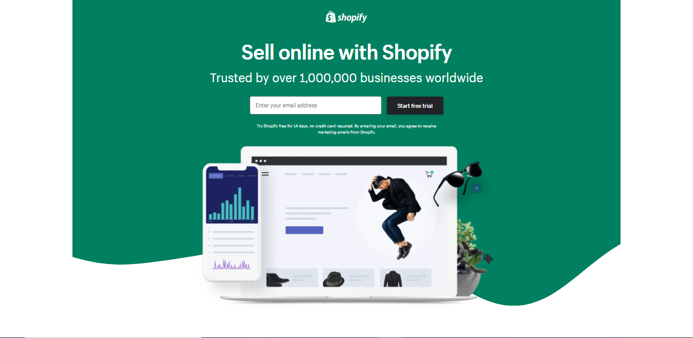
9. Shopify: The Prepared Landing Page
Shopify is a platform that helps users to build their online stores. This landing page is a perfect example of limiting the user’s options and giving a higher chance of signing up.
CTA at the Top of Page
Shopify’s landing page helps get that all-important email with just enough information. They have asked for the email at the top of the page. It’s one of the first and only actions that a user will take.
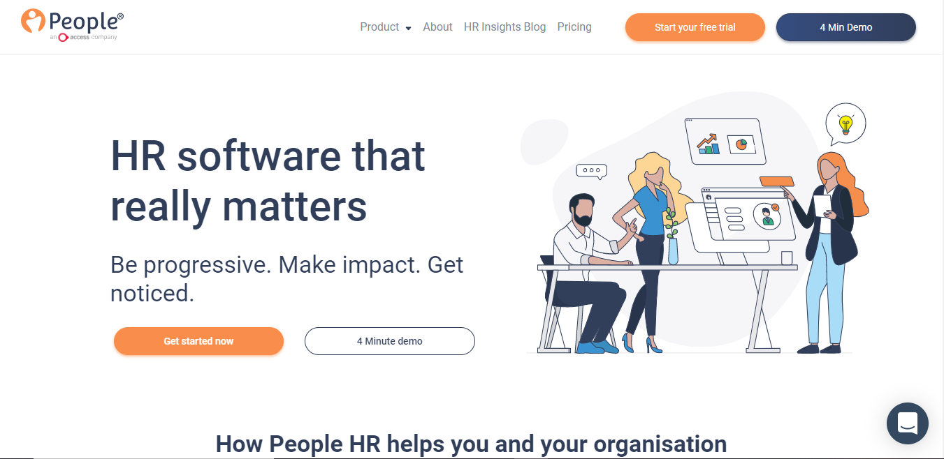
10. People HR: The Landing Page With Demo
People HR is an automated tool that helps you automate HR tasks. People HR has managed to incorporate many of the best landing page examples that we have discussed within one page. However, we will focus on one thing in particular with them.
Use a Demo
Offering a demo to the users is one of the best things to sell your product. One thing that People HR has done differently is managing expectations by giving the demo length within the CTA. Time is money, so make use of your customer’s time wisely, and they will respect you for that.
Let’s Wrap
We hope that these landing pages will help you craft your landing page designs shortly. We have highlighted many points in this article, so take the points that resonate best with your product or brand and go from there. There are few essential things to keep in mind: efficiency, design, content, value propositions, reviews, CTAs, and marketing automation are all critical features on an excellent landing page.
Categories
Recently Posted
beginners-guide
7 Most Common Misconceptions Regarding Bookkeeping
12/10/2021 7:44 AM
beginners-guide
Top Reasons Why Accounting Marketing Fails
12/10/2021 8:35 AM
web-design
5 Reasons Why You Should Choose us to Build Your New Website
08/12/2021 12:35 PM
small-business-tips
10 Effective Ways to Promote Your Website for Free
10/02/2021 10:18 AM
small-business-tips
How Having a Bad Website Can Hurt Your Business
15/02/2021 1:27 PM