
web-design
How to Choose Color Scheme for Website
10/10/2020 12:00 AM
How to Choose Color Scheme for Website
When it comes to your website design, you need to focus on giving your customers a great experience to get them addicted to your brand.
Imagine you have launched an excellent website for your business. Everything on your website is perfect, including the performance, the layout, the website copy, and the navigation. It will create a wonderful experience for your users, and they won’t stop admiring your website.
However, you will only create such a website when you’ll choose the right color scheme for your design. This article will help you with how to do that – even if you don’t have any experience regarding website design.
Colors play an essential role in how we see the world. Therefore, it can ultimately affect how we observe a website. But when we talk about the website design, color scheme often stay at a backseat. We have enlisted six essential tips in this article that will help you to create an excellent website with a great color scheme:
- Know the basics of color psychology
- Make yourself familiar with color theory
- Learn about mixing color combinations
- Keep it simple
- Consider contrast colors
- Integrate your branding
Whether you know working on color theory or are unsure about the difference between primary and secondary colors, these tips will help you choose the ideal color scheme while building your website. Let’s dive into the details!

1. Know the Basics of Color Psychology
Color psychology plays an important role in marketing. Today, we are going to talk about the most important basics that you should know.
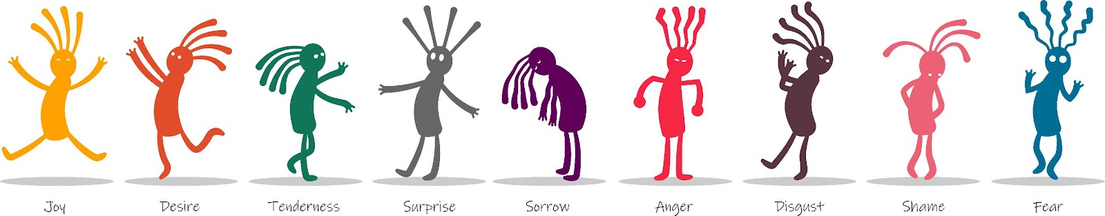
Color associations are quite powerful. All of us had developed them when we were infants, and they genuinely stay with us throughout our lives. These associations are natural and often unintentional.
Honestly, many of these associations are universal. For example, everyone thinks about leaves and nature when we talk about green color and yellow with the sun.
However, some of these are cultural. According to a study, Americans associate envy with black, red, and green, while Russians think that black, yellow, and purple are the envious colors.
Today, these cultural associations are supposed to be more critical than ever before because many brands are now maintaining a global presence. Depending on the color scheme you may use, people from certain countries might associate something negative regarding your brand, which you don’t want.
2. Make Yourself Familiar with Color Theory
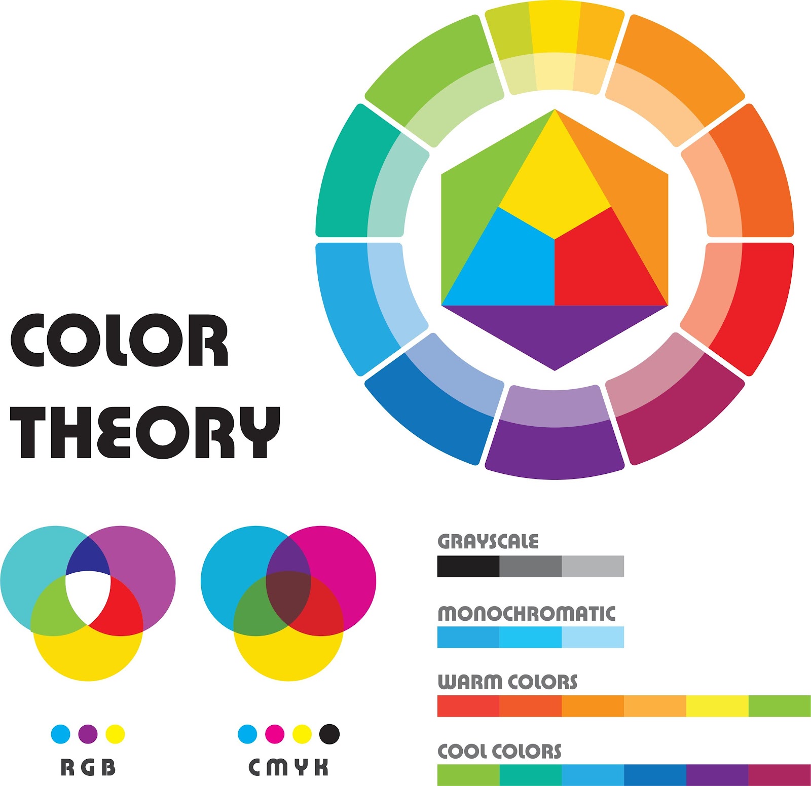
Overall, color theory is basically the science of how color works. It is not possible to explain the longer version, but colleges are offering entire courses for it. However, a few simple concepts help improve your knowledge about color for your website design.
First of all, you need to know about primary, secondary, and tertiary colors.
Primary colors:
These are the colors that can’t be made by mixing any other two colors. Red, yellow, and blue are the three primary colors.
Secondary colors:
These are the colors that you can get by mixing two secondary colors. For example, when you combine yellow and blue, you will get green.
Tertiary colors:
These colors can be created by mixing a primary and a secondary color next to each other on the color wheel. They can be combined to create compound colors; for example, mixing blue (primary) with violet (secondary) will create blue-violet.
Secondly, you need to understand the warm and cool colors.
You may already have an idea about warm and cool colors. Orange, red, and yellow are known as warm colors, while green, blue, and violet are known as cool colors.
Thirdly, you need to understand the concept of color nuances.
Every color you see isn’t a pure color. Many of these colors that you see online have been affected in a way or another.
It’s possible that you might see a tint color (color having white added in it), a shade (color that is having black added in it), or a tone (a color having grey in it).
It is possible that you may see an oversaturated or desaturated color. The saturation explains how bright or dull a color is.
There is a lot more to learn about color nuances, but those are just the basic points you need to know before choosing effective color combinations.
3. Learn About Mixing Color Combinations
Your goal is to pick the right color scheme for your web design. It means you need to look for the right combination of colors. It depends on how many colors you will end up working with. Your color scheme may consist of multiple color combinations.
While thinking about color combinations for your website, you need to understand these color nuances. It is critical to know why specific colors work together and modify them to suit your color scheme better.
Color theory is really helpful in telling us what colors will look perfect together. So when it is time for you to select the colors for your palette, there a few more advanced features of color theory that can be helpful for you to decide on the best colors for you.

4. Keep it Simple
While choosing a color scheme for your website, you need to think about simplicity to pick the right colors. There is no need to choose a busy color scheme as it often confused the eye.
There are two major advantages to keeping things simple.
The biggest benefit of simplicity is that it can effortlessly tie together a color scheme. If you are working with a few colors, everything will look combined.
Another advantage is that viewers don’t need to work hard to know what’s going on. That’s one of the trademarks of a great website. Your users can get confused if you go overboard on the color.
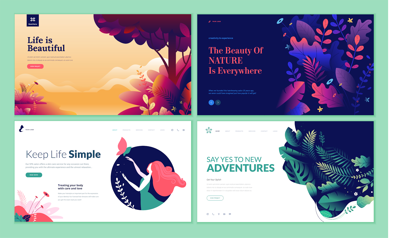
The best thing you can do to keep your homepage simple yet attractive, make use of three colors. A simple color scheme can be incredibly effective due to its simplicity. It shows that flashy colors are not always better.
Simple designs leave a great impact on the user. It would be best to keep simplicity in your mind while choosing a color scheme for your website.
5. Consider Contrast Colors
We need to keep contrast in our mind while choosing a color scheme for our website. It is one of the most critical elements of a good design that can be used to create an excellent website color scheme.
Contrast creates an impact on the user. Contrast can be helpful in drawing the attention of users to certain parts of the page. Contrast can be helpful to highlight CTAs on your page. For a perfect contrast, complementary colors should work together to contrast each other. Choose an ideal contrast for your CTA buttons to convert better.
So if you want to have something that the user will notice, make it contrast from the rest of the webpage.
6. Integrate your Branding
Finally, it would be best to consider how your branding will play a role in your color scheme. If your brand already has specific colors associated with it, you can use your existing color palette to design your website.
However, you may need to change your brand colors. You need to choose a different color if any of the colors you have chosen for your brand has a negative meaning.
That’s the key thing to understand; you need to think about the color associations that people have with the colors you have chosen for your brand. Are these associations reliable with the values of your brand?
You also need to check what other brands are doing. If we talk about display advertising, you may have seen blue to be popular among various brands.

You’re All Set to Start Color Scheming!
Now you have got all the tools that can be helpful to create an awesome and engaging color scheme for your website.
All that’s left is to go and start color scheming.
You may make some mistakes at the start, but that’s part of the process. Any good color scheme needs to go through its fair share of repetitions.
Categories
Recently Posted
beginners-guide
7 Most Common Misconceptions Regarding Bookkeeping
12/10/2021 7:44 AM
beginners-guide
Top Reasons Why Accounting Marketing Fails
12/10/2021 8:35 AM
web-design
5 Reasons Why You Should Choose us to Build Your New Website
08/12/2021 12:35 PM
small-business-tips
10 Effective Ways to Promote Your Website for Free
10/02/2021 10:18 AM
small-business-tips
How Having a Bad Website Can Hurt Your Business
15/02/2021 1:27 PM